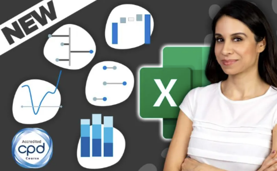
Leila Gharani – Business Charts in Excel
CREATE EXCEL CHARTS THAT GET YOU NOTICED
Feel like your Excel skills are falling behind?
Tired of making Excel reports that no one notices?
Imagine making Excel charts as powerful as those in The Economist and McKinsey, without getting stuck in slow, manual routines.
We get it – creating professional charts in Excel can eat up your time.
That’s exactly why our course focuses on MORE than creating charts that get noticed.
It teaches you formulas to make your reports dynamic so you can free up your valuable time for what matters.
Course Highlights:
- 8.5 hours of video lessons
- 60+ practice files & 50+ ready-to-use templates
- Quick Guide eBook on Excel Charts
- BONUS Cheat Sheets for fast learning
- LIFETIME Access so you never feel rushed
- English Closed Captions (created by a professional typist)
- Direct Support from our teaching assistants
- Digital Badge & Certificate of completion
Creating Engaging Charts in Excel Is Time-Consuming
If you lack the right techniques…
- You’ll struggle to make charts that explain your data clearly.
- Waste precious time on manual updates.
- Professional reports seem out of reach in a fast-paced business world.
Plus Excel keeps adding new features making it hard to keep up. There seem to be many powerful tools. But you’re stuck in the basics.
We don’t want that for you.
Creating professional Excel charts should be easy.
We designed this course so you can:
- Create Excel charts that exceed your manager’s expectations.
- Upgrade your skills with the latest Excel charting techniques.
- Master Excel formulas for dynamic, auto-updating charts.
- Select the right chart type, ensuring your data stands out.
- Present complex data simply, just like the experts at McKinsey and The Economist.
These charts don’t only look great but also save you time. You get to focus on what really matters.
Turn Data into Reports That Capture Every Colleague’s Attention
Join 400,000+ learners who’ve upgraded their Excel skills with us.
We know how challenging it can be to turn complex data into impactful charts in Excel.
Especially when your hard work goes unnoticed.
That’s why we designed our course to teach you quick methods for creating standout charts.
Visuals that are engaging, informative and at the same time minimalistic.
They’re rewarding to make. Rewarding to present. You’ll learn formulas to automate the making of your charts. So you don’t have to worry about adjusting your source data layout to fit your chart.
You’ll save a ton of time AND stand out for your skills.
Your 8-Step Roadmap to Chart Mastery
If Excel has ever made you doubt your abilities, you’re not alone. Go through the steps in the course and soon you’ll find yourself mastering more than just charts.
Turn Your Data into Engaging Stories
Stop wasting time with ineffective charts. Instead start making impactful visuals that get noticed.
But let’s face it, Excel can be tough and take up too much of your time.
We believe it should be easy to make charts that look good and tell a story. That’s why our course gives you all the shortcuts and support you need.
And there’s more to it than just looks.
Once you create an engaging chart, you want it to be responsive and automatically update. Because if not, your whole day gets swallowed up by trying to keep your charts and reports current.
Creating engaging AND self-updating charts is a skill few possess.
The best part?
In this course you’ll learn BOTH skills.
You’ll learn to make charts that update automatically with new data. No more wasting hours manually updating graphs for your monthly reports or presentations. Think of the extra time you’ll have for other work or to simply enjoy a well-deserved break!
“But Leila, Why Learn Business Charts from You?”
You have plenty of options for learning about Excel Charts, so why enroll in our new course?
For starters, as with all our courses, you’ll benefit from our XelPlus 3-pillars of teaching.
Pillar 1– We Speak Plain English
We don’t use jargon or “smart sounding” words when simple words will do. We start with the easy stuff to get you hooked. Then, you can go deeper.
We don’t scare you away by showing you the nerdy details right out of the gate.
Pillar 2 – We Give You Real World Examples
Business Charts are meant to help decision making and solve real world problems.
“What is this data trying to tell us?”
“What are we missing?”
“What should we do after this meeting?”
Some teachers are afraid to go there. They feel safe with theory.
Not us. We come from the trenches of industry.
We don’t shy away from real world examples. We lean into them.
Pillar 3 – We Show You the Big Picture
I’m the type who needs to see how everything fits together.
After all, nothing exists in a silo.
Some courses only show you how to create various chart types in Excel. Some only teach you how to transform raw data for visualization. Others show you how to create beautiful reports.
In our course we teach you both preparing the data and how to avoid manual updates. And yes, we show you how to create stunning visuals in Excel.
Our course teaches you not just to make great-looking charts and graphs but also to master Excel’s shortcuts and functions that speed up your work.
Our course will take you through a step-by-step learning plan. From Excel chart basics to advanced dynamic charts and automation.
Wow your coworkers and managers with smart time-saving techniques.
Here’s Your Learning Path
Check out the detailed curriculum below. Notice any topics that catch your eye?
Where would you like to start your learning journey?
Introduction
How to Succeed with This Course
Download Files & Templates
Looking for a Specific Topic? Use the Transporter!
Section 1: Excel Chart Basics
How to Pick the Right Chart (Answer these questions)
Creating Excel Charts: Data Structure, Multiple Series
Improving Charts: Adding Elements & Formatting
Essential Practices for Creating Standout Visuals
Quiz – Chart Basics
Key Takeaways Chart Basics
Section 2: Mastering Dynamic Charts in Excel
Creating Charts that Update Themselves
Excel Tables & Slicers for Dynamic Charts
Last 12 Months Dynamic Charts (No more Manual Updates!)
Connecting Charts to a Drop-down
Exercise: Switching Units in Charts with a Drop-Down
Dynamic Chart Titles: Add Clarity with Real-time Updates
Adding Context with Text Boxes and Labels like The Economist
Challenge: Interactive Chart with Slicer and Dynamic Text
Automatic Sorting in Charts for Better Reporting
Positioning Axis Labels to Avoid Overlap with Negative Values
PivotCharts with Slicers and Timelines
PivotTable Data to Power Standard Charts with Slicers
Key Takeaways Dynamic Charts
Section 3: Comparing Values
Creating Excel Charts for Impactful Data Comparisons
Column Chart Essentials: Simplifying for Impact
Conditionally Highlight Columns (Top & Bottom Values)
Advanced Column Charts: Auto-Updates & Dynamic Titles
Creative Column Chart Formatting: Beyond the Basics
– Challenge: Dropdown-Driven Conditional Highlights
McKinsey-Style Column Charts
DYNAMIC McKinsey-Style Column Charts
Compact Bar Chart with a Simple Function
McKinsey’s Lollipop Chart for Easy Comparison
Enhance Bar Charts with a Vertical Comparison Line
Dumbbell Charts: The Economist and BBC Style
– Exercise Pack to Sharpen Your Skills –
– Key Takeaways Comparing Values
Section 4: Showing Composition
Charts to Show Composition
Adding Totals to a Stacked Chart
Aligning Series Labels in Stacked Charts
Pie Chart & Doughnut Charts
Upgrading from Pie Charts: Sorted Bars with Extras
Treemaps to Explore Hierarchies
McKinsey’s Waffle Chart
– Challenge: Stacked BAR Chart with Totals
– Quiz – Showing Composition
– Key Takeaways Showing Composition
Section 5: Understanding Trends and Patterns
Captivating Line Charts with Simple Tweaks
Avoid Drop to Zero in Line Charts
Dynamic Series Label Integration for Multiple Line Series
Dynamic Data Labels: Frequency Selected from Drop-down
Forward-Looking Charts: Unifying Multiple Series into One
Economist-Style Multi-Line Slope Chart
Small Multiples Chart (Panel Chart) for Side-by-side Comparison
Excel Sparklines: Quick Visual Trends
– Exercise Pack to Sharpen Your Skills –
– Quiz – Understanding Trends
– Key Takeaways Understanding Trends
Section 6: Displaying Change (Variance, Growth, Before/After)
Designing Impactful Variance Charts in Excel
Building Connected Color-Coded Bar Variance Charts
McKinsey-Style Lollipop Variance Charts
– Challenge: Create a Column Lollipop Variance Chart
– Exercise: Column Variance Chart
Using Color-Coded Arrows in Charts
Waterfall Chart to Visualize Cumulative Impact
– Key Takeaways Displaying Change
Section 7: Presenting Tables in Excel
How to Best Present Data in a Table
Conditionally Change Row & Font Color
Subtle Color Coding for Key Changes
Use Bars and Arrows in Tables for Easier Readability
– Exercise: Table Formatting with Data Bars
– Quiz – Presenting Tables
– Key Takeaways Presenting Tables
Bonus: More Elite Chart Design inspired by McKinsey & The Economist
Heat Map: McKinsey-Style
Category Chart: The Economist-Style
In-Cell Bar Chart with Comments
Q&A Resource Hub
– Answer Vault
Wrapping Up
– YOU DID IT!
Everything Included in Your Enrollment
It’s time to say goodbye to the stress of making Excel charts.
With our course, you can elevate your skills from the comfort of your home.
You’ll get:
- The confidence and rewards that come from having cutting-edge Excel skills
- In-depth knowledge with over 8 hours of video lessons
- Files to follow along with each video lesson
- 50+ ready-to-use business chart templates you can use right away
- Lifetime access: Learn on your schedule & without deadlines
- Our topic transporter to quickly navigate to the topic you need
- Quick Guide eBook to master all aspects of Excel charts
- A comment section to get your questions answered by our staff (how awesome is that?)
- Credits for CPD to enhance your resume
- English Captions by a professional typist
- Quizzes to track how well you understand the concepts
- Challenges to test your knowledge
- Bonus: Our collection of Cheat Sheets to keep at your desk.
Get Leila Gharani – Business Charts in Excel at Tradersoffer.forex
Reviews
There are no reviews yet.